Tab style
Select your tab style.
Classic Style
Pills Style
Menu position
Select the desired position of your tabs menu.

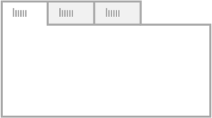
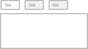
Top
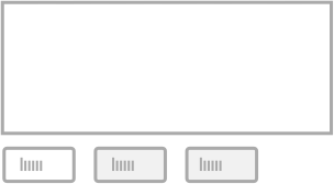
Bottom
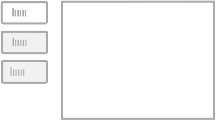
Left
Right
Styling options
Toggle the settings below to style your tabs as needed.
You can find styles for the Title Wrapper, Tab Titles, the Content Area and the Accordion.
title wrapper
Amount of tabs
Select the amount of tabs you would like to be using.
Title Wrapper Background
Select a background color for your title wrapper. If you want it to be transparent, move the opacity slider all the way to the left.
Tab Style
Select between the classic tab or pilled styled tabs.
Align Titles
Align your titles relative to the title wrapper.
Title wrapper positioning
Specify if your tab title wrapper should be positioned on the top, bottom, left or right from the tab content areas.
Wrapper width (left or right positioning)
Specify the width of your title wrapper, this option is only available for left or right positioned titles.
Margin pill menu wrapper
Specify the margin between the title wrapper and the content tab area. This will only be applied to tabs that have the pills style selected.
Title styles
'Classic' and 'Pills'-style title styles.
Text Titles above image
Use text as titles for your tabs.
Use Image Titles
Use images as titles for your tabs (position above image).
Text Titles under image
Use text as titles for your tabs (position under image).
Title Font Size
Specify font size for your tab titles.
Tab Title Color
Set the color your tab title for normal display.
Active Title Color
Set the color your active or selected tab title.
Title Background
Background color of tab title in normal state.
Active Title Background
Background color of active or selected title.
Vertical padding title
Increase the vertical space around your title.
Horizontal padding title
Increase the horizontal spacing around your title.
Title font weight
Select the font weight of your title. Will only apply if the selected font of your theme has the weights available.
Title letter spacing
Letter spacing is the separation between each letter individually of your title.
Align Text Titles
Alignment of your text titles.
Active tab on load
Tab that needs to be active/selected when the page is being loaded.
'Classic'-style titles only.
Tab title width
Toggle this on to specify a width for your tab titles. This option will only apply to top and bottom positioned title for classic tab style.
Tab title width
Specify a width for your tab titles. Please note that the value is in % and can't be set higher than 100 divided by the amount of tabs chosen.
Title width max
The width of the titles will take up the maximum possible width in relation to the width of the tab title wrapper.
Border Color
Select a border color. Only works for classic style. If a transparent border is needed, move the opacity slider all the way to the left.
'Pills'-style titles only.
Pills spacing
Spacing between each pill tab title individually.
Border Radius
Border radius for your pill styled tab titles, the higher the value the rounder it will appear.
Border Top Width
Border top width in pixels, only for pill style tabs.
Border Top Color
Border top color for pill tab titles in normal state.
Border Top Color Active
Border top color for pill title tabs when active or selected.
Border Bottom Width
Border bottom width in pixels, only for pill style tabs.
Border Bottom Color
Border bottom color for pill tab titles in normal state.
Border Bottom Color Active
Border bottom color for pill tab titles when active or selected.
Border Left Width
Border left width in pixels, only for pill style tabs.
Border Left Color
Border left color for pill tab titles in normal state.
Border Left Color Active
Border left color for pill tab titles when active or selected.
Border Right Width
Border right width in pixels, only for pill style tabs.
Border Right Color
Border right color for pill tab titles in normal state.
Border Right Color Active
Border right color for pill tab titles when active or selected.
Content Area Styles
content background color
Select a background color for your tab content area. If a transparent background is needed, move the opacity all the way to the left.
Vertical padding content
Vertical padding is the space above and below of your content inside the content area. Increasing the value will move the content away from the top and bottom margins of your area.
Horizontal padding content
Horizontal padding is the space left and right of your content inside the content area. Increasing the value will move the content away from the left and right margins of your area.
accordion styles
Accordion Trigger Width
Specify the screen width (value in pixels) on which the accordion display should be triggered.
Title Font Size
Font size for the accordion titles.
Scroll Offset title
When clicking on an accordion title, in responsive view, the page scrolls up so users don't get lost. With this value you can specify the distance from the top the selected title will be positioned. 0 will be at the very top, in case you have a fixed floating menu at the top you will need to increase this value and set it a little higher than the height of your navigation wrapper.
Hide all on load
Hide all your tab content on load, so only titles will be visible. This is only applies when the element is in accordion mode.