Tutorial Pop Up
All the tutorial info you require to start using the Pop Up element.
Pop Up Box - Settings
Pop Up Width
Specify the width of the Pop Up Window, the area where you drop your content.
The value set is in pixels and will be used as a maximum width, which means it will be displayed correctly on all devices.
Pop Up Name
It is required to give your Pop Up a unique name, at least when being used on the same page.
This is necessary so the script knows which Pop Up window you want to trigger using different events.
Pop Up Background
Set the background color of your Pop Up window.
Even when using an image as background it is always a good idea to specify a background color in case there is delay on the image to load, or an issue with loading the background image.
You can use the transparency slider to specify the opacity of the background color.
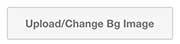
Use Background Image
Toggle on the 'Use Backgroun Image' setting if you prefer to use an image as a background over a color. Once this has been turned on, you will need to close the settings (remember to apply settings before closing), a new button will appear in your editor, right above the drop window of your Pop Up, saying: Upload/Change Bg Image.
Click on this button and you will see an image upload from Weebly, you are able to use Weebly's native image editor settings to modify the uploaded image.
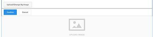
Functioning as a background image for your Pop Up, there is no perfect ratio or size, as the way the image is being displayed will depend on the content added inside your Pop Up. While there is no ideal size for your image, it shouldn't be too large in size and using the set width of your Pop Up could serve as a reference for the width of your image, since it won't be displayed larger.
Vertical Inner Padding
Increasing the space vertically around the content inside the Pop Up window, a higher value will move your content away from top and bottom, lowering the value will remove spacing around and closen content vertically to the top and bottom.
Horizontal Inner Padding
Increasing the space horizontally around the content inside the Pop Up window, a higher value will move your content away from left and right, lowering the value will remove spacing around and closen content horizontally to the left and right.
Close Button Styles - Settings
Show Close Button
Toggle this on if you want to hide the close button for your Pop Up.
Users will still be able to click on the overlay beside the Pop Up box to close the window
You are also able to add a custom close element inside the Pop Up box, for more info on this, check the tutorials on 'Pop Up Close', available in the side menu.
Close Button Background
Add a color and/or transparency for the background of your closing button. Make sure that you didn't toggle off 'Show Close Button'.
Close Button Color
The closing 'X' can also have a specific color set to it, as well as a transparency factor.
Close Button Border
Choose a border color for your Pop Up Close button that matches your style.
Overlay Styles - Settings
Overlay Background Color
Select a background color for the surrounding overlay for your Pop Up, also specify the transparency with the opacity slider. To have a fully opaque background set the slider all the way to the right, to have a complete transparency, move it all the way to the left.
Click Overlay
While this feature could have been added to the 'Pop Up Functions', we thought it'd made more sense adding it right where the overlay styles are. This function will either allow (Allow overlay to be clicked) visitors to close the Pop Up window by clicking outside the Pop Up box, or not allowing it (Do not allow overlay to be clicked).
Now and then it is a good thing to force users to make a selection, this can be achieved with a custom Pop Up Close element, more on this topic can be found back in the tutorials of the Pop Up Close element, which can be accessed by navigating to it in the left sidebar.
Pop Up Functions - Settings
Reveal Animation
You can specify the way the Pop Up box gets animated into the view of your visitor, a selection of 27 to choose from.
Something to give an extra touch of professionalism to your site.
Reveal Duration
The animation that reveals the Pop Up to your visitor is happening over a specific time span, you can increase/decrease this value, so it is slower or faster.
The value is in milliseconds, so 1 second equals 1000ms.
Not to be confused with 'Delay Auto Pop Up'.
Show Pop Up on Load
You can choose wether the Pop Up has to be shown to your visitor when the page has been loaded.
Together with this feature in the remaining settings you can specify the delay it needs to take before it is being shown as well as the need for cookies.
Delay Auto Pop Up
When you have chosen to show the Pop Up to your visitor on page load, you have an additional option of specifying the time that needs to pass before it is shown.
The value is in milliseconds, so 1 second equals 1000ms.
Use Cookie
Cookies are being used to plant info on your visitors browsers so next time they return these values can be used.
In this case they can be used to specify the duration in time between each time a visitor returns to your page and the Pop Up should show up. Using cookie will only work when 'Show on page load' has been selected. The value is in days, so when you set the value 7 (days), that Pop Up won't be shown to the same visitor within the next 7 days of his visit to your site. This is a great way of not being too intrusive to your visitors and always keep showing him the same Pop Up.
To set expiration time of cookie, specify in the 'Expiration Cookie'.
Cookie Name
It is required to give your cookie a unique name, so the browser knows which Pop Up has already be shown.
This name can be a combination of numbers and letters.
So you can call your cookie for example: halloweenspecial2017
Cookie Expiration
When you selected to use a cookie for your Pop Up, you need to specify the time in days when this specific cookie will expire and be removed from the users browser.
During the set days the Pop Up with the specific cookie name won't be shown for this amount of days. (only to the same visitor obviously).
Show Pop Up when reaching bottom
This is another way to automatically trigger a Pop Up window, if a user is on your site and scrolls down and reaches 100px from the bottom of your page, the Pop Up will be shown.
A great way to maybe lead a visitor to another page, related to the one he was just going through.
Show Pop Up when visitor leaves page
This is another way to auto trigger a Pop Up, you are able to interact one last time with your visitor, right before he tries to leave the page, trying to close it, a Pop Up is shown.
When using this feature a very attractive last attempt to guide your visitors should be shown.
Autoplay Video
When you're Pop Up contains a video and you want to play that video when the Pop Up has been opened, make sure to select this option.
This feature is currently working for Weebly videos and Youtube videos added.
Pop Up Trigger - Settings
General
Adding the Pop Up Trigger onto your page will provide you with a new drag and drop area, everything added inside that area will function as a trigger to show a specific Pop Up window.
The Pop Up that has to be shown on click will need to have the exact name that you gave to the Pop Up window.
The trigger
Make sure to use the name (not the link/url) of the Pop Up window you want to trigger when this specific area has been clicked upon.
You can click on the plus icon at the right of the name inside your Pop Up window added, this will copy the correct name to your clipboard, this way you only have to paste it in the 'Add name of Pop Up' field.
Pop Up Trigger Fixed - Settings
General
The Pop Up Trigger Fixed will allow you to add an element at the top left/right, center left/right or bottom left/right of your page. This element will remain visible to the visitor, even when scrolling down.
You will be able to add text and/or an image, and specify styles for both large screens and small screens.
Just as with the normal Pop Up Trigger, here you will need to add the exact name (not the url) of the Pop Up window and use it in the 'Add name of Pop Up' field
Pop Up Name
Make sure to add the name for the Pop Up window that needs to be shown when a user clicks on the fixed position button.
You can grab the name, not url, from the Pop Up window by clicking on the + icon on the right of the Pop Up name.
Button Text Desktop
Add your specific text that will be shown inside the Pop Up Fixed button trigger.
Button Text Mobile
Add your specific text that will be shown inside the Pop Up Fixed button trigger in mobile view.
Hide In Editor
When toggling on this setting the buttons will be hidden from your view inside of the Weebly editor. You can always make them visible again by turning off this setting.
It could be useful when desiging other elements on the page, so it won't take up space.
Trigger Common Styles - Settings
Button Background
Select a background color for your fixed positioned button. You can also specify transparency by using the opacity slider under the color picker. The more to the left the more transparent,the more to the right the more opaque.
Text Color
Select a color for the text of your button. You can also specify its transparency value if needed.
Button Font Weight
If available for the font family included in your Weebly theme, you can specify the font weight for the text.
Light - Normal or Bold.
Border Radius
Make edges rounder by increasing the value, in case you would like to have square shaped edges, add the value to 0.
Border Width
Thickness of your border, a value in pixels.
Border Color
Specify a border color for your fixed positioned button.
Trigger Position
The fixed positioned button will always be visible to your visitor, even when scrolling down.
Define where you would like to have the button visible:
Top/Left - Top/Right - Center/Left - Center/Right - Bottom/Left - Bottom/Right
Desktop Button Settings
Hide Desktop Button
If you would like to hide the button for larger screens over 767px, you are able to turn on this setting and your button will only appear for smaller screens.
Use Text
Your button can have either text or an image, hiding the text option will remove any text for the button.
When this is hidden, make sure to use an image as a trigger and upload an image later in the editor part.
Font Size
Specify the font size of your button for screens larger than 767px in width, the value is in pixels.
Vertical Padding
Increasing vertical padding for your button will increase the space above and under the text/image of your button.
The higher the value, the taller the button will be in height.
Horizontal Padding
Increasing horizontal padding for your button will increase the space left and right of the text/image of your button.
The higher the value, the wider the button will be.
Mobile Button Settings
Hide Mobile Button
If you would like to hide the button for smaller screens under 767px in width, you are able to turn on this setting and your button will only appear for larger screens.
Use Text
Your button can have either text or an image, hiding the text option will remove any text for the button.
When this is hidden, make sure to use an image as a trigger and upload an image later in the editor part.
Font Size
Specify the font size of your button for screens smaller than 767px in width, the value is in pixels.
Vertical Padding
Increasing vertical padding for your button will increase the space above and under the text/image of your button.
The higher the value, the taller the button will be in height.
Horizontal Padding
Increasing horizontal padding for your button will increase the space left and right of the text/image of your button.
The higher the value, the wider the button will be.
Pop Up Close - Settings
General
With this element you can create custom close elements inside your Pop Up window, so that when a user clicks on the text, image or other added inside this area, the Pop Up will close.
It is a good way to ask for some confirmation on something, e.g. terms of use or other.
Approval Required
When using approval required, you will have to set the close button to hidden as well as the "Don't allow the overlay to be clicked" inside the settings of your Pop Up window. This is a perfect way to validate info of a user, maybe age verification, to see if your visitor is old enough to continue browsing your website.
This setting has to be used in combination with 'Show Pop Up on Load'.
When toggling on this option do also make sure you are not using cookies for this specific Pop Up window.
Note: this Pop Up will only be shown once to the visitor.
List of videos
Adding a Pop Up
In this example, we will create a quick Pop Up and set it to autopop after 3 seconds.
We use a cookie with a custom name which will expire after 30 days. The width of the Pop Up has been narrowed for looks.
Using the Pop Up Href as trigger
There are two ways you can link to the Pop Up. In the first one, which is the easiest and fastest working, as well as for code as for editor work on user's end.
We simply click on the plus icon at the right of the href field, this will copy it to your clipboard, having this link we can use it in any Weebly element that can have a link added.
Using the Pop Up Name as trigger
In this example we will use the Pop Up Trigger element, this will allow us to include any element inside,
even if it can't be linked, or if you would like to link a whole block as content, without it being a link.